We’re going deep inside the making of a book, with interviews from Penguin Random House employees in editorial, marketing, sales, and more. If you’ve ever wondered about all the behind-the-scenes work that goes into making your favorite books, this is the series for you.
Today we’re featuring an interview with Aileen Boyle: VP, Associate Publisher, Director of Marketing and Publicity for Blue Rider Press and Plume.
What do you think is special or unique about this book? Why will readers want to get their hands on it?
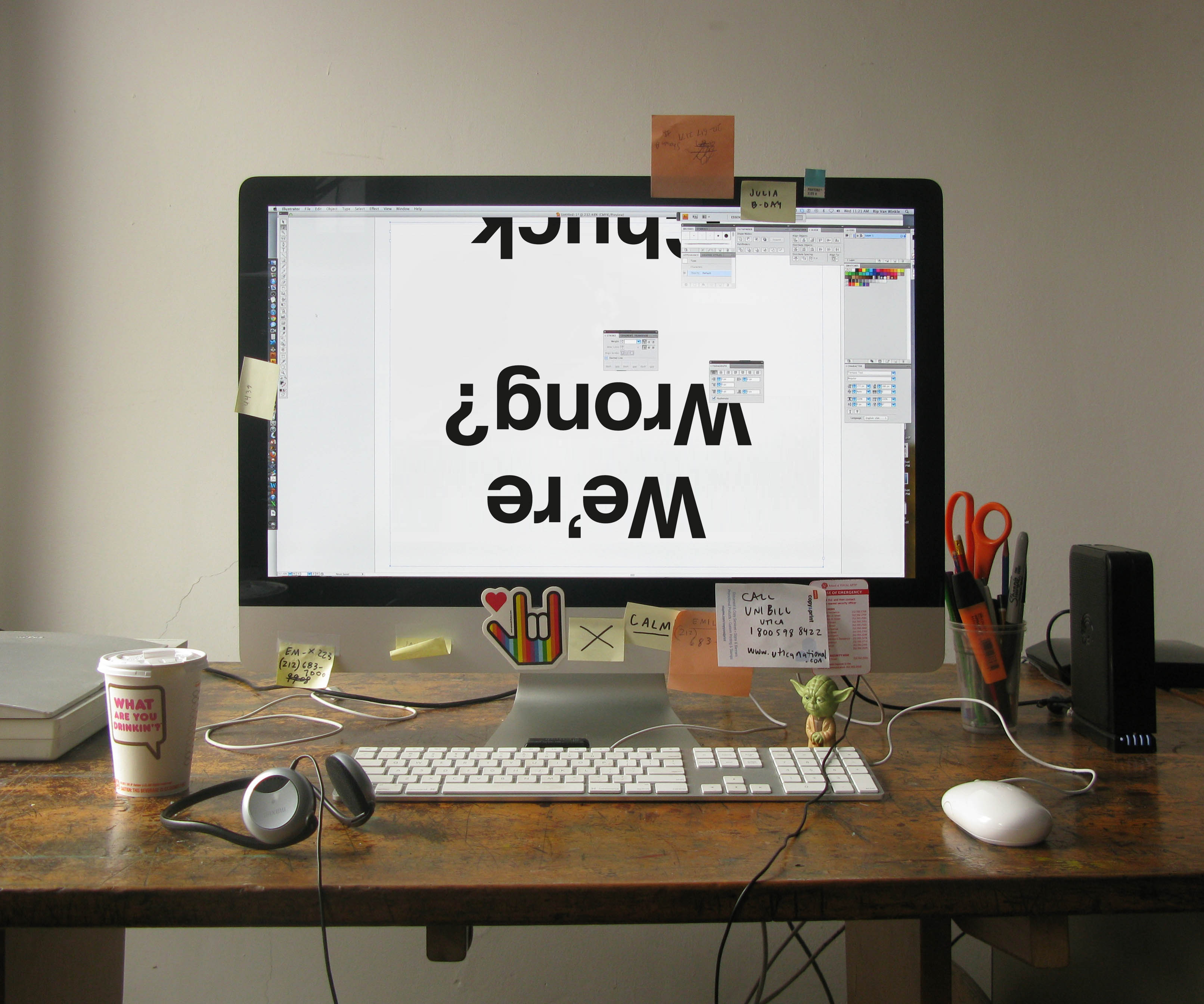
Where to start? In this particular case, the reader should feel free to judge a book by its cover: the contents may turn your worldview upside down, or at least challenge you.
Designer Paul Sahre and art director Jason Booher hit it out of the park – this book could sit under glass at the Whitney and fit right in. Great design is such a helpful tool for a publicist to get the media’s attention as well as to stand out in a bookstore.
Now that we’ve gotten the reader to pick the book up, what should they expect between the covers? This is where the fun really begins. Chuck is a brilliant cultural commentator, not only in the way that he makes a point or constructs an argument, but in how he gets the reader thinking. But What If We’re Wrong? has something for everyone: literature, music, politics, science, philosophy and more. I’m not a sports person, but the chapter on football is fantastic and now I can drop that knowledge on my brother-in-law (finally). Other readers will likewise learn a few things, without question.
How would you describe your job and how you worked on But What If We’re Wrong? to a layman? What are some of the steps you take when you first start working on a title?
I’ll start with the end goal of my job: to have a reader discover a new book and get interested enough to buy it.
Booksellers, media and social media influencers are my outside partners to help me reach this goal. Booksellers have events. The media does reviews or interviews. Social media allows us to talk to readers or those they care about directly. My job, alongside my brilliant team, is to pull all of these levers for a book’s publication.
When a dynamic and popular writer like Chuck pens a provocative, forward-thinking book that can be read by a wide variety of people, I’ve got a lot to work with. I collaborated with author, publisher, editor and agent to set goals of how we wanted to reach readers and the message we wanted to convey. We started working on this early –about nine months (or more) ago. It’s exciting to be almost at the point of publication after all of this anticipation in-house.
Describe the book in one sentence.
A book that makes a persuasive case for the importance of doubt – sorely needed in an age where we think we know everything.

Do you have a favorite line from the book, or a section you particularly love?
While there is no material benefit to being right about a future you will not experience “there are intrinsic benefits,” Klosterman writes, “to constantly probing the possibility that our assumptions about the future might be wrong: humility and wonder. It’s good to view reality as being beyond our understanding, because it is. And it’s exciting to imagine the prospect of a reality that cannot be imagined, because that’s as close to pansophical omniscience as we will ever come.”
How closely do you work with the editor, art department, etc. when working on a title?
All members of our imprint work closely together. Publicity and marketing is the midwife in a book’s birth. The book has been gestating for a while– being written, edited, designed, printed, sold in by reps etc. – but then the labor begins, in the form of a publicity tour which can be physically exhausting and maybe even painful at times. But publicists are there at the crucial moment of publication day (a book’s birthday!) and when it’s well-received and sells lots of copies, I personally feel happy and proud by association.
(I might be saying this because my daughter kept me up last night and Chuck and his wife just had a baby, but I think the analogy is apt!)
Read first post in this series here, and find out more about But What If We’re Wrong here:


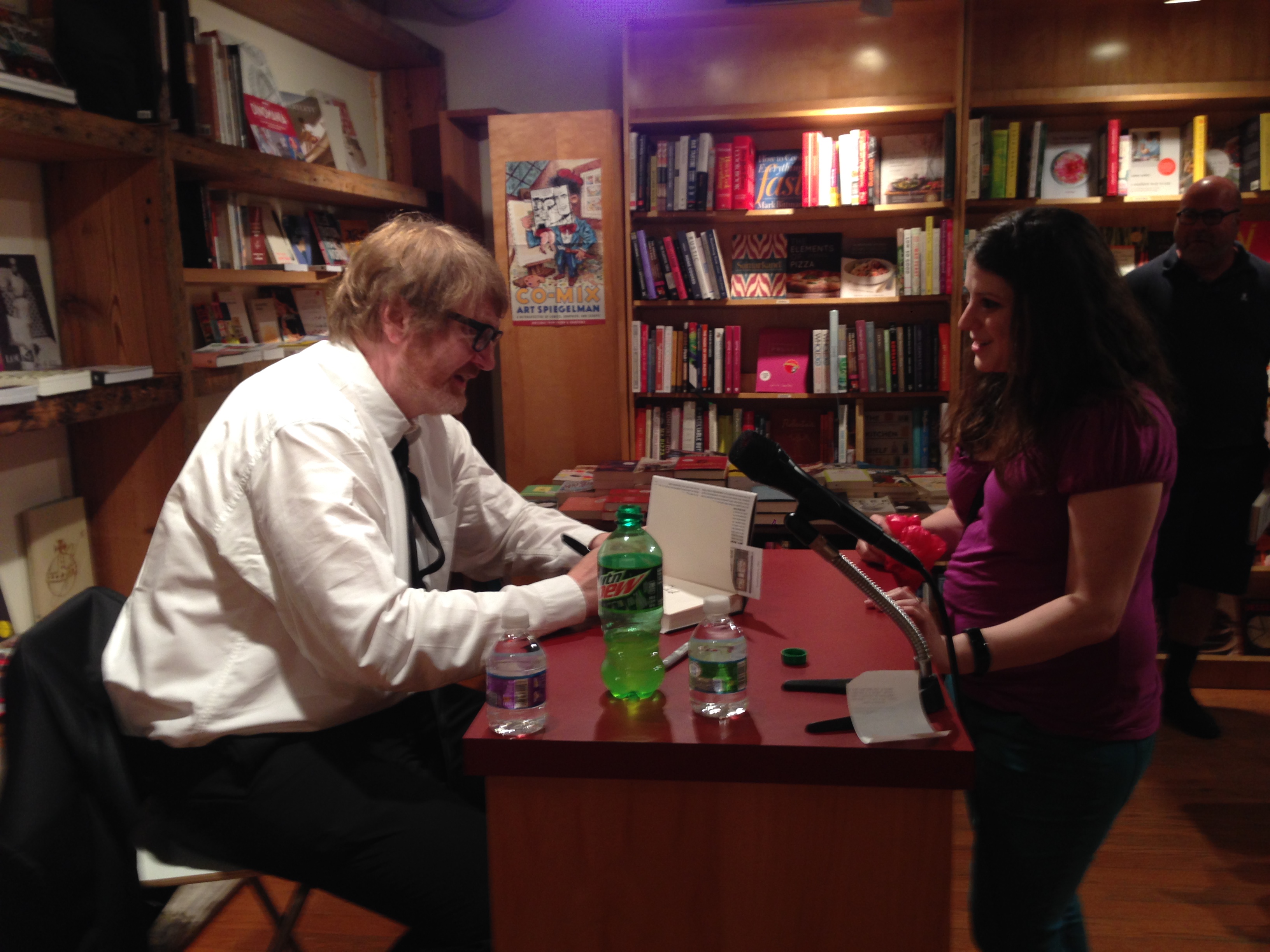
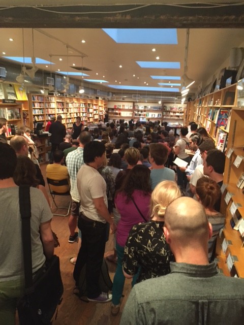
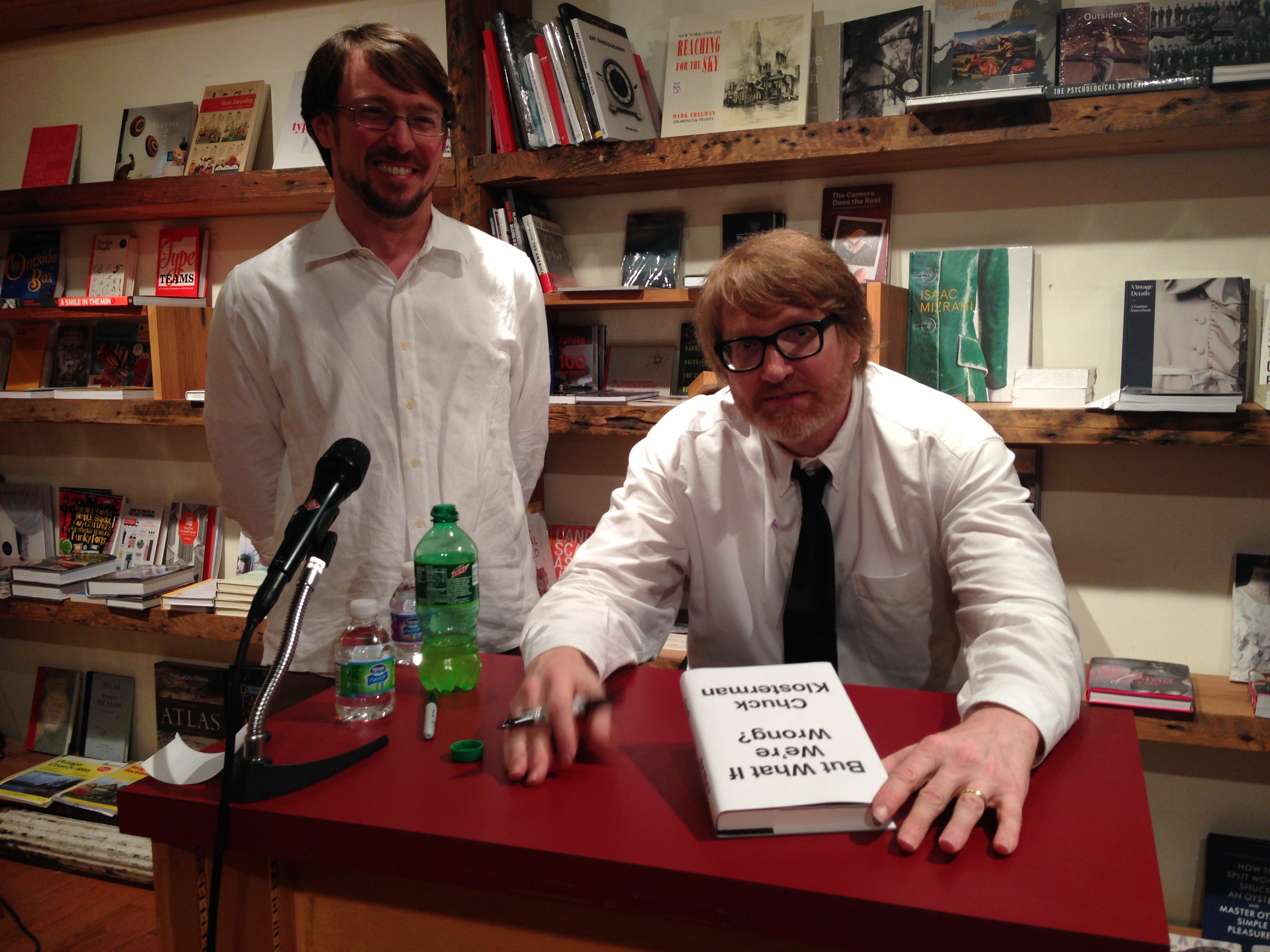
 Chuck read from his book and signed copies for fans… and it was a packed house!
 Today we’re featuring an interview with Andrew Unger, events and publicity manager of Brooklyn bookstore, BookCourt.
What is your job title, and what does that mean? What’s your day to day? What would surprise a layman to know?
I am the events and publicity manager. My daily schedule is varied and unpredictable, but focuses primarily on acting as the voice and public face of BookCourt. I manage our Twitter, Facebook, Instagram, and the back-end of the BookCourt website. I do all of this in addition to coordinating events for the store. We have one of the most robust calendars of any bookstore in the city, supporting over 300 authors every year. I think everyone, layman and professionals, are surprised to find out just how genuinely moved I am by the opportunity I have to work at one of the premier independent bookstores in the country.
What’s it like working at BookCourt vs. any other bookstore?
Jonathan Lethem has this wonderful quote he gave us once where he said that BookCourt was a university and a party in slow motion. I’ve always loved that way of talking about the store. As usual, Jonathan Lethem was able to put it so much better than me. On the weekends, we see a vast array of people. Old, young, local, tourist … it’s hard to not get a little whimsical about the “scene.” When you’re here and you’re the one that people look to for a recommendation or for a friendly conversation about one of your favorite books, it always feels almost too good to be true. I’ve only ever worked at BookCourt, but I don’t know that this particular blend of magic could be found anywhere else.
Today we’re featuring an interview with Andrew Unger, events and publicity manager of Brooklyn bookstore, BookCourt.
What is your job title, and what does that mean? What’s your day to day? What would surprise a layman to know?
I am the events and publicity manager. My daily schedule is varied and unpredictable, but focuses primarily on acting as the voice and public face of BookCourt. I manage our Twitter, Facebook, Instagram, and the back-end of the BookCourt website. I do all of this in addition to coordinating events for the store. We have one of the most robust calendars of any bookstore in the city, supporting over 300 authors every year. I think everyone, layman and professionals, are surprised to find out just how genuinely moved I am by the opportunity I have to work at one of the premier independent bookstores in the country.
What’s it like working at BookCourt vs. any other bookstore?
Jonathan Lethem has this wonderful quote he gave us once where he said that BookCourt was a university and a party in slow motion. I’ve always loved that way of talking about the store. As usual, Jonathan Lethem was able to put it so much better than me. On the weekends, we see a vast array of people. Old, young, local, tourist … it’s hard to not get a little whimsical about the “scene.” When you’re here and you’re the one that people look to for a recommendation or for a friendly conversation about one of your favorite books, it always feels almost too good to be true. I’ve only ever worked at BookCourt, but I don’t know that this particular blend of magic could be found anywhere else.
 When you order books from a publishing company, what do you consider? What makes a book attractive to you and your customers?
We have store bestseller list at the front. This list features the bestselling books from the previous week. Consistently, these books reflect the same taste as reviewers for the New York Times, the New Yorker, and the New York Review of Books. Our customers prefer something sophisticated and intellectually stimulating. Proud as all of us are of our libraries, there’s just no escaping a good cover. Many bad books have been sold through good cover designs and, far and away, too many great books have been relegated to a dusty corner of the shelf because of an ill-advised cover. Occasionally, a truly great book will arrive in the store. Gone Girl or Building Stories. These are anomalous and rise to the top with a momentum born from nowhere else except the compelling narrative itself.
When you order books from a publishing company, what do you consider? What makes a book attractive to you and your customers?
We have store bestseller list at the front. This list features the bestselling books from the previous week. Consistently, these books reflect the same taste as reviewers for the New York Times, the New Yorker, and the New York Review of Books. Our customers prefer something sophisticated and intellectually stimulating. Proud as all of us are of our libraries, there’s just no escaping a good cover. Many bad books have been sold through good cover designs and, far and away, too many great books have been relegated to a dusty corner of the shelf because of an ill-advised cover. Occasionally, a truly great book will arrive in the store. Gone Girl or Building Stories. These are anomalous and rise to the top with a momentum born from nowhere else except the compelling narrative itself.
 Tell me about some of the events and community-building at BookCourt.
In the early-aughts a Barnes & Noble opened up just a few blocks away from the store. It’s presence was intimidating and unwelcoming. The communities of Cobble Hill and Carroll Gardens rallied behind us in an impressive way. There are many great neighborhoods in New York, but these two have helped curate and foster one of the most impressive booms in Brooklyn. Today Court Street, as it runs from Atlantic Avenue into Red Hook, is ripe with local, family-owned businesses. In an age when small business is struggling for air, the residents of Cobble Hill and Carroll Gardens have created something truly special. Because of their dedication to us, we’ve dedicated ourselves to serving them. Our events are free and open to the public and through these events we are able to feature internationally celebrated authors as well as local and debut authors.
Tell me about some of the events and community-building at BookCourt.
In the early-aughts a Barnes & Noble opened up just a few blocks away from the store. It’s presence was intimidating and unwelcoming. The communities of Cobble Hill and Carroll Gardens rallied behind us in an impressive way. There are many great neighborhoods in New York, but these two have helped curate and foster one of the most impressive booms in Brooklyn. Today Court Street, as it runs from Atlantic Avenue into Red Hook, is ripe with local, family-owned businesses. In an age when small business is struggling for air, the residents of Cobble Hill and Carroll Gardens have created something truly special. Because of their dedication to us, we’ve dedicated ourselves to serving them. Our events are free and open to the public and through these events we are able to feature internationally celebrated authors as well as local and debut authors.
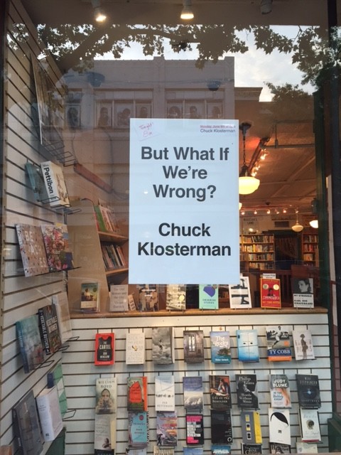
 What’s interesting to you about But What if We’re Wrong? How would you describe it to a reader? Why would they want to read it?
But What If We’re Wrong? was so engaging to me because it highlighted the best qualities of Chuck Klosterman’s personality. He is a friend of the store an often in and out. The writing is reflective of Chuck’s cadence and temperament. Thoroughly researched, he delivers prescient wisdom with a light-touch and a flare for the unexpected. The cover design, its simple, understated message of turning something on its head was ingenious and wonderful. I was the most surprised by how the footnotes at the bottom of the page operated as an aside to the reader in a way that looked at quick glance like a moniker of sophistication but read like a nudge and a wink. In almost every way, the book asked over and over again, the question of its title. Not often is a reading experience so cohesive and stream-lined.
What’s interesting to you about But What if We’re Wrong? How would you describe it to a reader? Why would they want to read it?
But What If We’re Wrong? was so engaging to me because it highlighted the best qualities of Chuck Klosterman’s personality. He is a friend of the store an often in and out. The writing is reflective of Chuck’s cadence and temperament. Thoroughly researched, he delivers prescient wisdom with a light-touch and a flare for the unexpected. The cover design, its simple, understated message of turning something on its head was ingenious and wonderful. I was the most surprised by how the footnotes at the bottom of the page operated as an aside to the reader in a way that looked at quick glance like a moniker of sophistication but read like a nudge and a wink. In almost every way, the book asked over and over again, the question of its title. Not often is a reading experience so cohesive and stream-lined.
 Which books are your go-to books to sell? Any old standbys?
People expect a booksellers to possess an intimate knowledge of not only all of their favorite books, but also of all the books they haven’t yet read. Great booksellers are up for the challenge. We all spend a lot of time pouring over reviews and ripping through as many books as we can. I don’t want to take the magic out of bookselling, but here are some pointers.
—Don’t recommend Bolano. Don’t be that guy. When you’re asked about it, gush appropriately because he’s amazing. Other writers that fall into this category are Don DeLillo, Thomas Pynchon, Dostoyevsky, J.D. Salinger, and Phillip Roth. (There’s a pattern)
—Listen, listen, listen. What did they do that day? What movies do they like? Are they quiet, nervous, excited, busy, jaded? Most of the time, people know what book they want, you just have to listen to them describe it and pull it off the shelf.
—Here is what you recommend in a pinch:
Which books are your go-to books to sell? Any old standbys?
People expect a booksellers to possess an intimate knowledge of not only all of their favorite books, but also of all the books they haven’t yet read. Great booksellers are up for the challenge. We all spend a lot of time pouring over reviews and ripping through as many books as we can. I don’t want to take the magic out of bookselling, but here are some pointers.
—Don’t recommend Bolano. Don’t be that guy. When you’re asked about it, gush appropriately because he’s amazing. Other writers that fall into this category are Don DeLillo, Thomas Pynchon, Dostoyevsky, J.D. Salinger, and Phillip Roth. (There’s a pattern)
—Listen, listen, listen. What did they do that day? What movies do they like? Are they quiet, nervous, excited, busy, jaded? Most of the time, people know what book they want, you just have to listen to them describe it and pull it off the shelf.
—Here is what you recommend in a pinch: