Stephanie Moss: The interior design process is very collaborative and we work closely with the authors. When the manuscript is submitted to editorial, the authors also share art, design notes and reference material for the different types of pages throughout the book. Our first task is to then flesh out those ideas into the designs for the pages that appear most frequently. Afterward, we’ll focus on the more unique pages throughout the book. These pages often involve partnering with talented illustrators, like Marie Lu, Meinart and Stuart Wade, to create Hanna’s diary pages and the ship schematics and logos. Each set of designs is then shared with the editor and authors where we’ll discuss possible changes and finesse each idea until it best captures the vision for the book. After the main pages are approved, we’ll begin bringing all the different components together and lay out the entire book. This is also the time when we fine tune some of the one-off page designs.
Ray Shappell: Yes, indeed. The Illuminae Files are ultimately their brainchild, so our goal in designing the series was to enhance their unique storytelling with a one-of-a-kind package. This series is more technically complicated than any other, and requires a huge collaboration with everyone involved. Once editorial and design approve a cover, we share it with the authors and value their opinions through each step of the process.
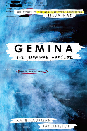
Creating the cover for Gemina was actually a breeze, compared to the process for Illuminae, because I already had an established series design. When I start a new series, I always think about how the current design would work for a second and third book. (Or more if we’re lucky.) So when we finally nailed down the concept for book 1 in The Illuminae Files—a brightly colored explosion interacting with the redacted documents from the story through acetate and a printed case—I also had a rough proposal for Gemina and the third book in the series. When Jay and Amie were in the offices celebrating Illuminae’s launch last November, I shared the proposed visuals for Gemina and they loved it!!! Coincidentally, the color of the blue explosion fits perfectly with the description of a black hole in Gemina. And the proposed image for book three is…XXXXXXXXX (redacted).
 What is your favorite part of your job?
Ray Shappell: My favorite part of the job is creative problem solving. After reading the manuscript, I have so many concepts and design ideas. I love sketching them all out—picking out typefaces, colors, textures, illustrations, hand lettering, or hiring an illustrator, photographer, or CG artists—all to match the tone of the story. But since I’m not the only one involved, there will be multiple moments throughout the cover design process that require finding a new solution that addresses the needs and concerns of everyone involved, while maintaining creative integrity of the original concept and design. This is extremely fun and rewarding when you are able to make a final piece of artwork that becomes the book jacket. The Illuminae Files is a great example of this working at it’s best – the end product is a much better version of the original concept.
Stephanie Moss: The best part of my job is collaborating with a lot of talented people. Particularly with Gemina, it was exciting to pull together everyone’s ideas then work with artists and a wonderful designer, Heather Kelly, and see those ideas get interpreted in really neat ways.
What would surprise a layman to know about your work?
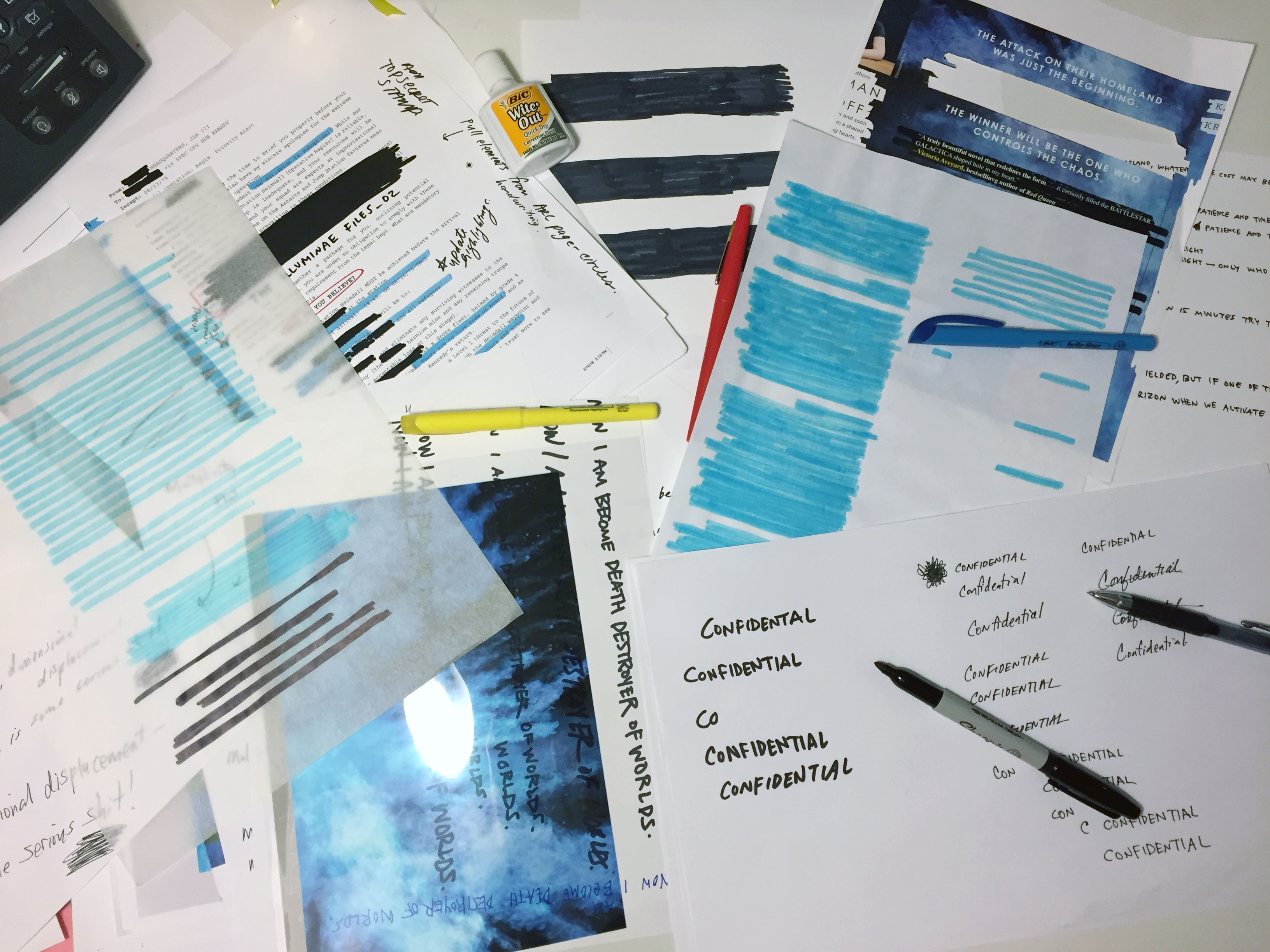
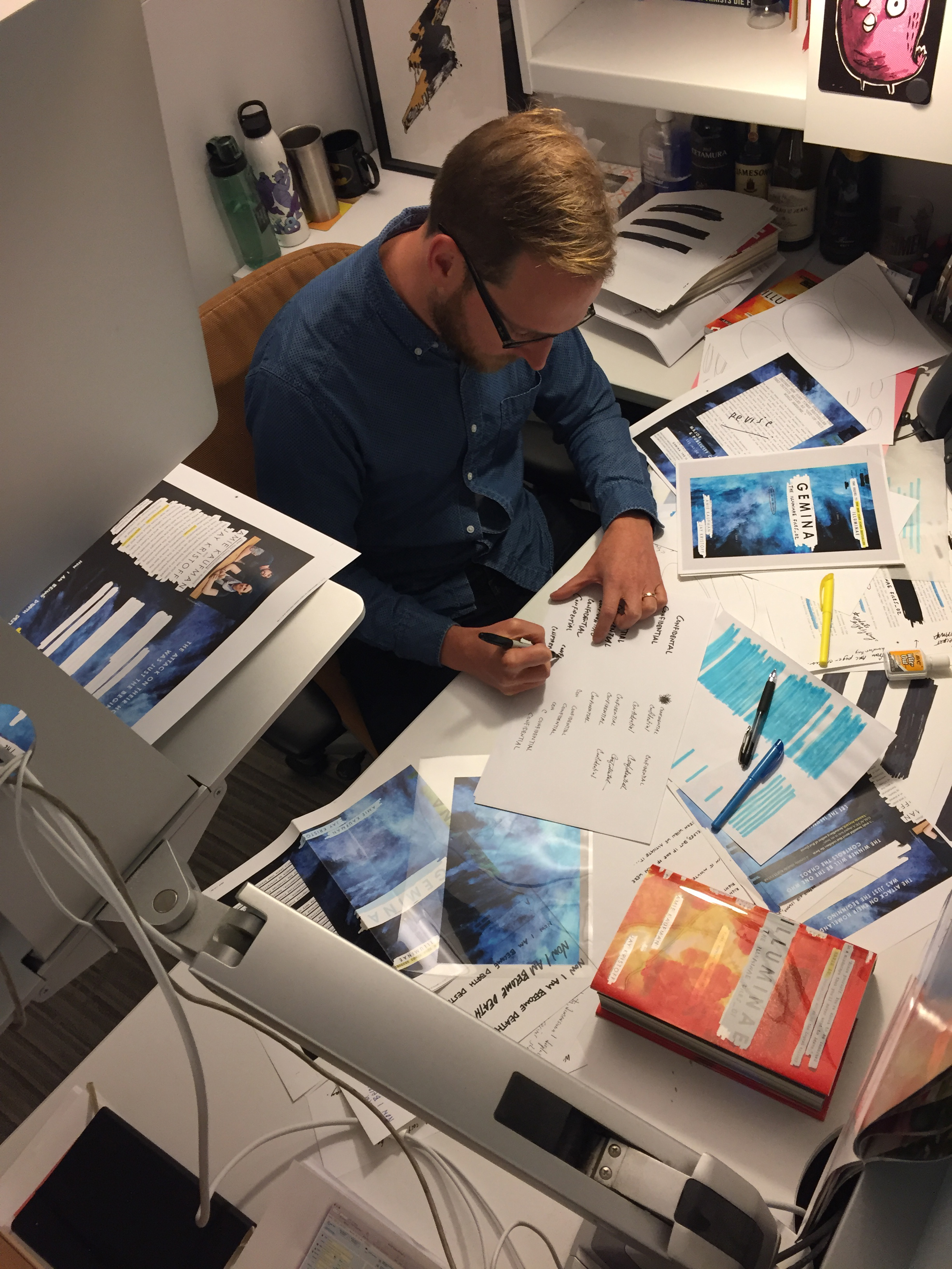
Ray Shappell: I love keeping physical authenticity of design over digital effects when possible. So in the case of Gemina, I actually set the files up clean on the computer first. However, once copy is approved, I then print out the covers and take a bunch of Sharpie markers, highlighters and tracing paper over to a light box. I cross out everything, scribble over the redacted areas, and make it messy. Then I scan it back into the computer and continue to line up all if the sharpie marks over the type on a different layer. I think it looks more realistic than if I used a digital marker.

What did you most want this one to convey?
Ray Shappell: I think that a successful jacket does a few things:
- It intrigues you and draws you in, making you pick it up and want to learn more about the story.
- It has great design (visual balance of graphic elements, typography, artwork, color, etc.)
- It stands out from the competition in a new and fresh way
- It informs you about the content from a very quick glance.
For The Illuminae series, our goal was to portray as much of the interior as we could on the cover, since it’s such a creative and unique story telling experience. Using the acetate to reveal and redact text from the case underneath was our solution for showing pieces of the story—with layers of actual text and phrases—in a new and exciting manner. I hope you enjoy the secret messages that are printed in the negative of the opaque white ink!
How has your approach to designing covers changed over time?
Ray Shappell: I’m hoping to push what’s possible in our YA market. I know how to make covers that will be liked and approved easily. But I prefer the challenge to create covers that push the limits of what we have seen before. Yes, they may require extra convincing and more energy, but the end result is a cover that really stands out from the rest.
I also have been incorporating more technology into my designs. I’ve created animated gif covers for Illuminae and Gemina, but I just finished working with a CG studio to create a fully animated cover for an upcoming series. Along with an augmented reality app, it brings the print book to life! It’s AMAZING and should be out shortly!!

Follow the authors on Twitter (@AmieKaufman, @misterkristoff) and Instagram (@amiekaufmanauthor, @misterkristoff)
Visit the website here: illuminaefiles.com


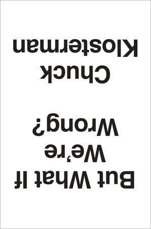
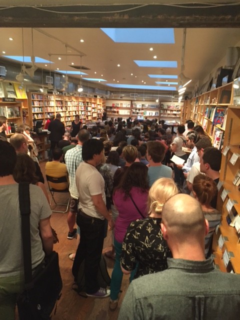
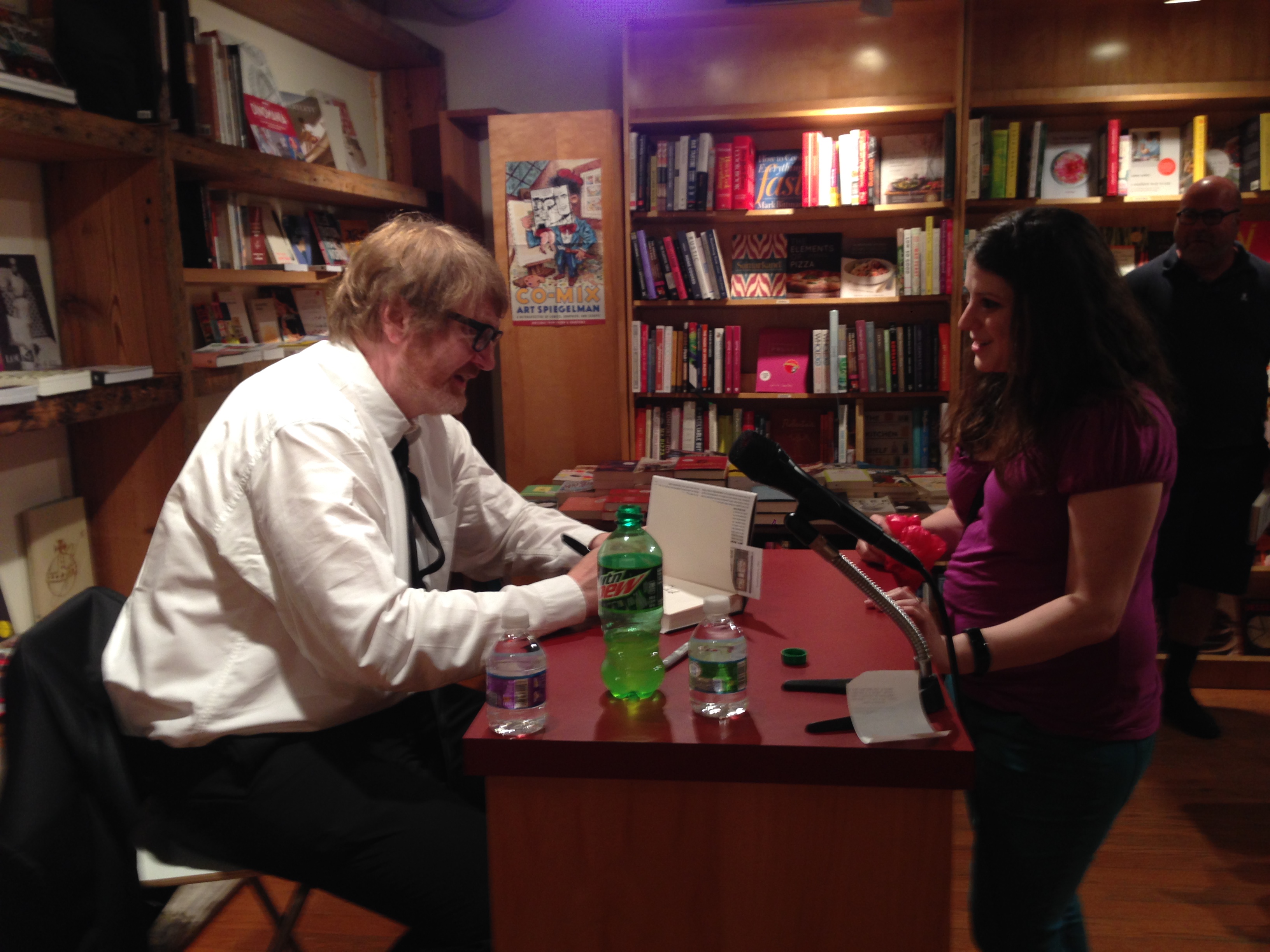
 Chuck read from his book and signed copies for fans… and it was a packed house!
 Today we’re featuring an interview with Andrew Unger, events and publicity manager of Brooklyn bookstore, BookCourt.
What is your job title, and what does that mean? What’s your day to day? What would surprise a layman to know?
I am the events and publicity manager. My daily schedule is varied and unpredictable, but focuses primarily on acting as the voice and public face of BookCourt. I manage our
 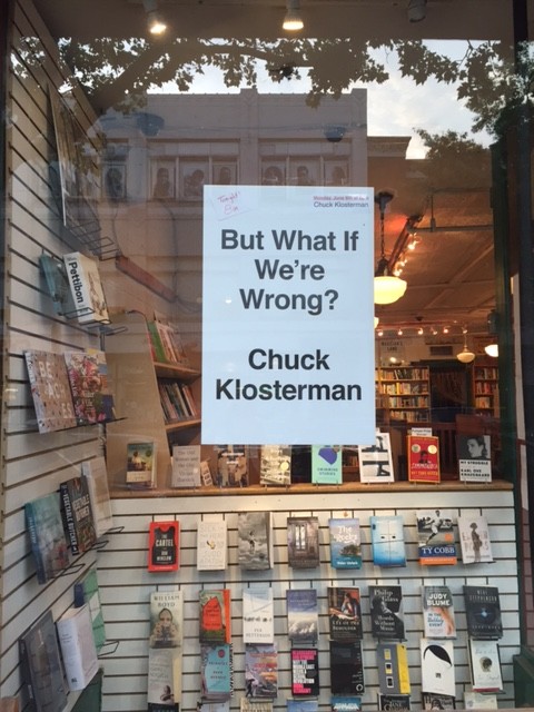 When you order books from a publishing company, what do you consider? What makes a book attractive to you and your customers?
We have store bestseller list at the front. This list features the bestselling books from the previous week. Consistently, these books reflect the same taste as reviewers for the New York Times, the New Yorker, and the New York Review of Books. Our customers prefer something sophisticated and intellectually stimulating. Proud as all of us are of our libraries, there’s just no escaping a good cover. Many bad books have been sold through good cover designs and, far and away, too many great books have been relegated to a dusty corner of the shelf because of an ill-advised cover. Occasionally, a truly great book will arrive in the store.