Author Q&A
Shawn Speakman: Hi Terry, how are you?
Terry Brooks: Doing well. I’m back from a month spent in another part of the world and hard at work on the book for 2010.
SS: What prompted re-covering the Landover books?
TB: I have lobbied for that re-covering for some time. The cover art for the first five Landover books felt outdated to me, a product of the 1980s and early 1990s. The British publisher, Orbit, had already re-covered the books not once, but twice in that time. I thought we should do the same. The agreement was that it would happen when I wrote the sixth and latest book, but I was a little slow getting around to doing that. So now we have new covers for A Princess of Landover, out this August/September, and for two omnibus editions combining the earlier five books.
SS: Who comes up with the ideas for the cover art on your books?
TB: How would I know? Elves, I think. Okay, I’m kidding. It’s really a combination of suggestions posed by myself, by the people working on the books at Del Rey and by the artist, Steve Stone. Everyone gets their say, and it usually produces the right result.
SS: When in your career did you gain a modicum of control over your covers? Do you get final say in the finished product?
TB: After Lester del Rey passed away, I asked to have a say in what would happen to future covers. This request was fueled in part by a growing understanding of what cover art was all about, a concern that without Lester things might go askew, and a feeling that it was important for me to have a voice in all aspects of my work. Del Rey was receptive to the idea – maybe because they thought I could be reasonable and not demanding about things – so it was agreed that my editor, the artist and I would confer about the cover before a final form was decided on. Since that time, I can think of only one instance when I wasn’t entirely happy about the result. That was with the cover art for the books of the Word & Void series, and all those covers are now gone.
SS: Out of your numerous covers, do you have a favorite?
TB: Here we go again, asking me to choose between my children. I think the new cover of A Princess of Landover is pretty spectacular. I like the sense of space and possibility it suggests. But, really, I like all the new covers that have been done since the beginning of the new century.
SS: One you haven’t really cared for?
TB: Well, you have that answer above, but I’ll add to it because I just thought of another. I didn’t like the cover to Black Unicorn because I thought the unicorn looked very much like a cross between a donkey and a rat. I griped about it endlessly, but Lester told me to set the book face-out in the middle of other books on a table or stand in a bookstore and walk across the room and look back. If my eye was drawn to Black Unicorn rather than some other book, Del Rey had done its job. Sure enough, he was right.
SS: The cover art for the Landover Omnibus Volume I features Ben Holiday holding a machete as he looks upon a vine-covered Sterling Silver. What do you think this symbolizes, as the scene doesn’t appear in the book?
TB: Cover art is supposed to be representative, but not necessarily literal. The old science fiction paperbacks were notorious for putting a robot or a half-naked woman on the cover, but neither would appear anywhere in the story. The idea was to attract readers and sell books. I still think that idea is valid, I just want to see the covers have some semblance of reality to the content. So Ben standing within an old-growth forest in view of a castle is accurate for what happens, and the machete suggests he didn’t get there easily. That’s close enough.
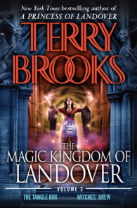
SS: Do you like how Nightshade is depicted on Landover Omnibus Volume II? Does it match what you see in your mind when you are writing her?
TB: Here’s the truth. Almost none of the covers depict the characters as I see them in my own mind. But that’s all right. That’s part of what makes books special. Each reader sees things in his or her own way; there’s no uniform consensus as there is in movies where everyone sees everything the same way because what’s projected is all visual. I like it that the visual of books takes place in each reader’s mind and belongs to each reader alone. So what I think doesn’t matter unless the cover depiction is totally wrong. Fortunately, that hasn’t happened.
SS: The cover of A Princess of Landover features a nice shot of Sterling Silver. How close is Steve Stone’s artwork to what you originally saw in your mind two decades ago?
TB: Pretty close. The castle is a bit worn about the surface, but there is the clear suggestion of the magnificent structure, a fairytale depiction. It could have been done differently, but I like what Steve did with it here. His work always amazes me.
SS: Anything else you’d like to say about the new covers?
TB: Only that I like them very much. I was hoping for a change I could live with when the decision was finally made to go ahead with the recovering, but what I ended up with are covers that I really like. That’s as much as any author has a right to ask of a publisher.


